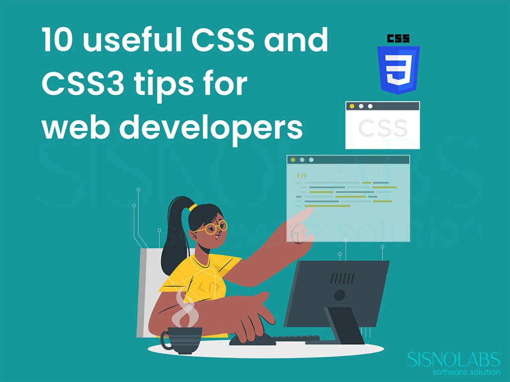
CSS3 made web designers and web developer’s life very easy. In this post we are covering some useful CSS code, mostly CSS3 tips for web developers/designers. Though some code will only run on modern browsers.
1. Using Multiple Background Images
Consider this example, in which we have to show two different images inside a page or a div, traditionally when we need to implement something similar to this we used to join the two images and create one image and set it as background, but the problem with such kind of implementation was that it was not dynamic, i.e. if needed to increase the height/width of the container we had to resize the image.
This can now be implemented by using multiple background images, which is now possible by CSS3. The advantage of this kind of implementation is that if the height of the container div increases the top image will be always at the top and the bottom image will be displayed at bottom only the image’s are not affected i.e. not stretched, they are displayed as they are. Moreover we can use ‘n’ no. of images.
div#bg2images{

background-image:url(1.jpg),url(2.jpg);

background-repeat: no-repeat;

background-position: center center,left top;

width:500px;

min-height:300px;

background-color:#fff;

border:1px solid #ccc;

padding:5pt;

}
2. Content With Image as Border
The border-image property, provided by CSS3 is tricky and very useful because it takes a single image and turns it into a complete object border for any sized element.
Earlier to achieve this effect we had to cut image into pieces, so that it appears properly on each side and corner of the element its being applied to, this has now been simplified due to border-image property.
The border-image is view able in all major browsers except for IE .
.imageborder1{

border-width: 20px;

-moz-border-image: url(frame.gif) 30 20 round; /*Mozilla version*/

-webkit-border-image: url(frame.gif) 30 20 round; /*Webkit version*/

-o-border-image: url(frame.gif) 30 20 round; /*Opera version*/

-ms-border-image: url(frame.gif) 30 20 round; /*IE syntax when it does support this prop*/

border-image: url(frame.gif) 30 20 round; /*Standard version*/

width:300px;height:auto; background-color:#fff;

}
3. Selectors
Selectors are one of the most helpful yet ignored topic of CSS. These selectors are highly used along with J-Query, to apply effects to content of the site.
My name is Donald. | :first-letter, selector is basically useful for highlighting the first word of any element..myp:first-letter |
We have learned a lot through Internet (Other Geek’s technical blogs / forums / website). So we are trying our best to share our knowledge and experiences of web development via our blog. | :first-line, selector is used to highlight’s the first line of any element. |
| :first-child, selector is used to select the first-child of any particular element such as div’s, paragraph etc. Similar to :first-child there are : only-child, :nth-child(n), :nth-last-child(n), :last-child, that can be of great use. Let’s take example , while applying border (top border / bottom border) on any element. If top border is applied on the first element too, it will look odd. With the help of first child selector we can hide, the border for first element. .mydiv ul li:first-child |
Selector ::selection is used to highlight anything that is selected, try selecting any word from this post, either double click on the word, or drag the cursor, and the text will be highlighted with a different color.::selection | |
| Enter Name Enter Password | The [attribute=value] selector is also one of the most important selector of CSS, consider an example where we need to apply generalized CSS for all the input boxes of our site, we can do this byinput{The disadvantage of this method is that it will apply CSS to the buttons also, this can be fixed by [attribute=value] selector, in this we can tell that it should apply the CSS only to those input boxes that are text, this can be implemented as follows, input[type=text]{The second input type is of type password hence background-image is not applied to it. |
4. Resize and text-overflow
This is a very useful example of how resize and text-overflow property of CSS3 can be used together. Resize property allows us to specify if an element is resizable. It can be resized either horizontally, vertically or in both directions. Moreover we can give a max-width, so it won’t break the layout completely, and a min-width so that we can’t make it to small either.
At times its not possible to display all text inside an element, the text needs to be clipped. For instance when it overflows the element’s box. When this happens, and we want to leave a visual “hint” to the user that text has been clipped we can use the text-overflow property.
Example of Resize and text-overflow property.
 div#resize

{

border:2px solid #000;

padding:10px 10px;

width:200px;

min-width:200px;

max-width:500px;

height:50px;

resize:both;

overflow:hidden;

white-space:nowrap;

text-overflow:ellipsis;

-o-text-overflow:ellipsis;

}
5. Word Wrap
The word-wrap property allows long words to be able to be broken and wraped onto the next line. It takes in two values; normal or break-word. If the width of box is already fixed the long word breaks out of the box as there isn’t enough width for it to be fully contained in the box. If break-word property is used then the long word is broken into two pieces, so that the second part wraps onto the next line. This is currently supported in IE, Safari, and Firefox 3.1
This paragraph contains a very long word: thisisaveryveryveryveryveryverylongword. The long word will break and wrap to the next line. | This paragraph contains a very long word: thisisaveryveryveryveryveryverylongword. The long word will break and wrap to the next line. |
.clsforp{

width:11em;

border:1px solid #000000;

word-wrap:break-word;

}
6. 2D Transforms – Scale
The transform property applies a 2D or 3D transformation to an element. This property allows us to rotate, scale, move, skew, etc., elements. Out of these, we are considering Scale, Scale method helps in scaling the height and width of the element, i.e. the size of the element can be increased or decreased along the X and Y axis. This kind of transformation can be highly used to give beautiful HOVER effects.
.mytransform{

margin:10px;

width:100px;

height:20px;

background-color:#FFD1ED;

border:1px solid #fff;

}

.mytransform:hover{

background-color:#FFBDBE;

padding-left:5px;

margin:10px;

transform: scale(1.5,1.5);

-ms-transform: scale(1.5,1.5); /* IE 9 */

-webkit-transform: scale(1.5,1.5); /* Safari and Chrome */

-o-transform: scale(1.5,1.5); /* Opera */

-moz-transform: scale(1.5,1.5); /* Firefox */

}
7. CSS 3 Gradient Effect
The CSS linear-gradient() function creates an image which represents a linear gradient of colors. The result of this function is an object of the CSS gradient data type. Like any other gradient, a CSS linear gradient is not a CSS colour but an image with no intrinsic dimensions; that is, it has no natural or preferred size, nor ratio. Its concrete size will match the one of the element it applies to.
#insetBgd {

width: 550px;

height: 100px;

background: #E900D9; /* Old browsers */

background-color: #E900D9;

background: -moz-linear-gradient(top, #E900D9, #86007d);

background: -o-linear-gradient(top, #E900D9, #86007d);

background: -webkit-gradient(linear, left top, left bottom, color-stop(0,#E900D9), color-stop(1,#86007d));

filter: progid:DXImageTransform.Microsoft.gradient(startColorstr='#E900D9', endColorstr='#86007d');

}
This kind of gradient images are mostly used many times in Web pages, to create background of page or to create shaded menu or to create buttons. Replacing images and using gradient effect is beneficial as images take time to load, and it gets difficult to modify the images if any changes are to be made in them.
8. Image Sprites
CSS image sprites are a way to use single large image made up of smaller images to improve our page loading time, by reducing the number of requests our server does to load different images. Have a look at the following image, this is a single image.
We have now created the below images of Home and Next by using parts of this single image.
 | HOME |
| NEXT |
img.home

{

width:46px;

height:44px;

background:url(img_navsprites.gif) 0 0;

}

img.next

{

width:43px;

height:44px;

background:url(img_navsprites.gif) -91px 0;

}
9. Positioning
1. Absolute positioning
An element which is positioned absolute does not obtain any space in the document. The position of an element is calculated from the sides of the view port. The top, right, bottom, left properties determine the position of an absolutely positioned element.
If you want to position an element 100px from the top of the document window, you would use the “top” offset to position it there with absolute positioning.
This element will then always display 100px from the top of the page – no matter what else displays there in normal flow.
#abspos{

width:100px;

height:100px;

background-color:#DCFFF0;

border:2px dotted #C0DED1;

position: absolute;

top:150pt;

left:-80pt;

}
2. Relative positioning
The position for an element which is relatively positioned is calculated from the original position in the document. That means it starts from where the element would be if it were still in the normal flow. You can move the element to the right, to the left, up or down. This way, the element still obtains a space in the document after it is positioned.
#relvpos{

width:100px;

height:100px;

background-color:#DCFFF0;

border:2px dotted #C0DED1;

position: relative;

top:4pt;

left:14pt;

}
3. Fixed Positioning
Fixed positioning is a lot like absolute positioning. The position of the element is calculated in the same way as the absolute – from the sides of the view port. But fixed elements are then fixed in that location. Everything else on the page can scroll except that element.
#fixedpos{

width:100px;

height:100px;

background-color:#DCFFF0;

border:2px dotted #C0DED1;

position: fixed;

top:0pt;

left:0pt;

}
10. Z index
At times its important to display one HTML element on top of other HTML elements, this can be the case while performing any transaction or by default showing some element over other, this can be done using Z-index.
#div1 { | #div2 { | #div1woz { |
#div2woz { | <div id="div1woz">Div 1 without Z-Index</div><div id="div2woz">Div 2 without Z-Index</div>Div 1 without Z-Index Div 2 without Z-Index Div 1 with Z-Index 2 Div 2 with Z-Index 1 | |